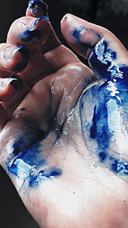
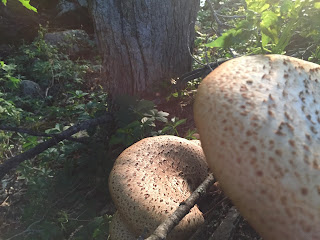
The repeated stems and the big leaves that frame the edges of the photo are what caught my eye while on the walk. I also enjoy the variety in colors because of the decaying bits and the tiny yellow flowers in the middle.
9/20/16
9/15/16
Composition
-Talking about Composition-
(not my photo)
Out of the three pictures given to us, I like looking at this one the most. The billboard is nearly smack in the middle of the composition, but it is at an angle that doesn't make it awkward-looking. The bottom coincides with the horizon line near the other mountains, creating almost an illusion of realness for this mountain until further inspection. The wispy clouds at the very top all point in towards the billboard, drawing our eye to it. The other clouds are in a nearly straight line at the top third and just create a nice border for the top of the board and a break in the blue so the board doesn't blend in with the sky. The fence could also bring your eyes from the front right back to the horizon line on the left.
Colors in the picture are also important. The yellows, greens, and blues that are occurring naturally all work well together. The brown of the fence and the slice of grey from the road are both moving in the same direction towards the back of the photo, and give a nice break from a continuous mix of the greens. The billboard has slightly more saturated hues that the rest of the composition, which makes it stand out.
Overall, I just think it's beautiful. :)
Response to editing
-Response to Editing-
My picks
Classmate picks
Reflection:
I chose the top two pictures as my favorites. The golden dogs were picked because I like how there are two in the foreground but the focus is on the one is the middle. The pups are shiny, and the guys in the front end up having a bokeh effect, which I also enjoy. The complexity of their shines and my emotional attachment to these little tape dispensers is why I ended up with this as a favorite.
My other favorite is the picture of the bed of teeny yellow flowers. The back of the flowerbed ends a third from the top of the frame, which was pleasing to my eye. Also, the color scheme of mainly yellow, along with the secondary colors orange and green, seemed balanced.
The Bananas and the storefront were not my picks, but are also pretty okay pictures. They were chosen by my classmates for their creative depth of field and angles. I think a possible reason for the difference in our choices could be that it wasn't possible to zoom in on the previews, or that since I was the one taking the photos that I have a different emotional perception of them. I didn't put as much effort into the second group, and therefore don't enjoy the end result as much.
9/13/16
Color Theory
There are three 'primary colors' and they can be mixed
together to form any color on the color wheel.
Two primary colors together create a secondary color
and tertiary colors are made when a secondary and
nearby primary color are mixed.
I picked the color yellow because it is a very bright color that easily catches my eye.
For me, yellow symbolizes happiness,youth, and awake/alertness. It could also symbolize fear and danger, however, depending on how it is used.
9/9/16
Class activity (9/6/16)
Depth of field: shot at f5.0
Depth of field: shot at f8.0
Depth of field (Sarah Hinzman)
Depth of field (Sarah Hinzman)
Depth of field (Makenzie Pelletier)
Depth of field (Makenzie Pelletier)
Subject moving
Stopping motion
3 or more people in frame
Portrait of a classmate
Something you might overlook
Subject is small part of photo
9/8/16
9/6/16
9/3/16
Subscribe to:
Comments (Atom)


